Anachronoid
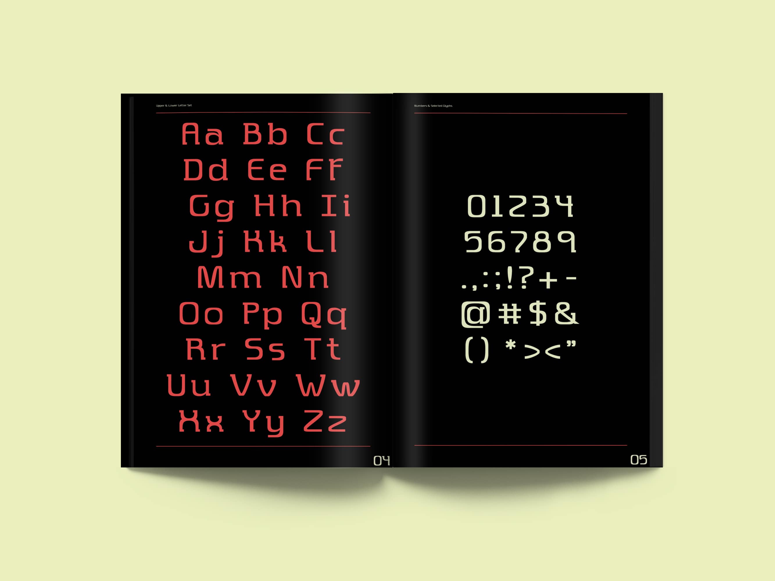
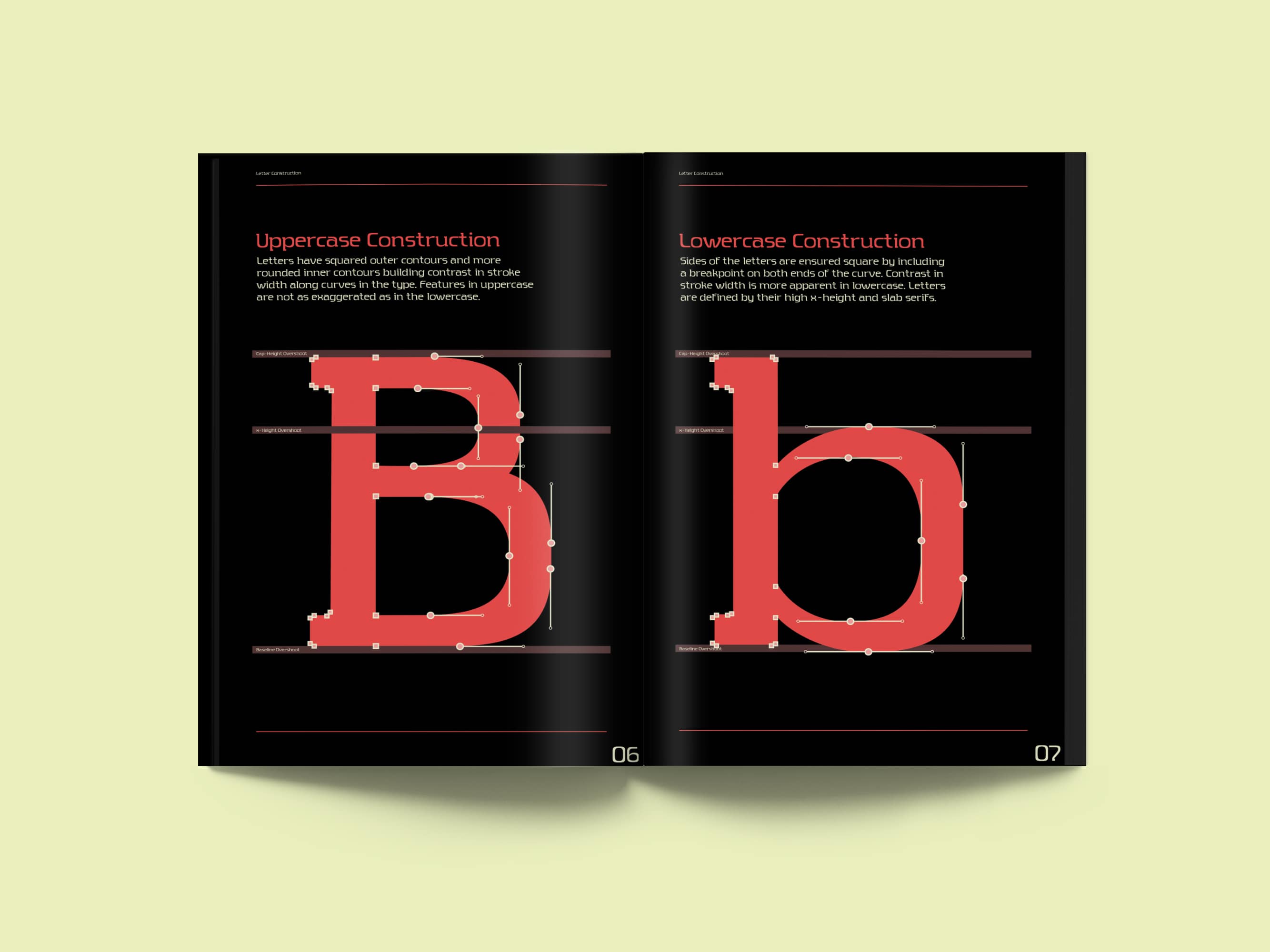
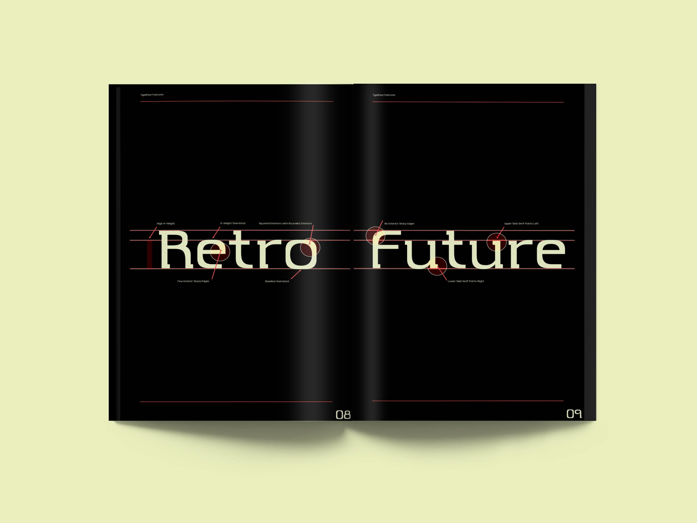
Anachronoid is based on geometric typefaces rooted in retro futurism which were popularized through use on science fiction book covers. With more squared off outer contours and rounded inner contours, there is contrast in the stroke width, especially seen on generally rounded characters. The idea evolved into a typeface that strayed away from harsh edges, especially those created with diagonal strokes. The typeface also features a slab serif that matches the weight of the thinnest strokes. The serifs are present in some unpredictable spots with the top serifs pointing left and the bottom serifs pointing right, with few exceptions. These serve as something between a structural component and decorative component.
The name Anachronoid is derived from the words “anachronism” and “android” both stemming from the research done on a retro future aesthetic and the idea of the space age. Android more specifically speaks to the nature of the type face in that it has almost machined edges juxtaposed with the organic interior shapes.
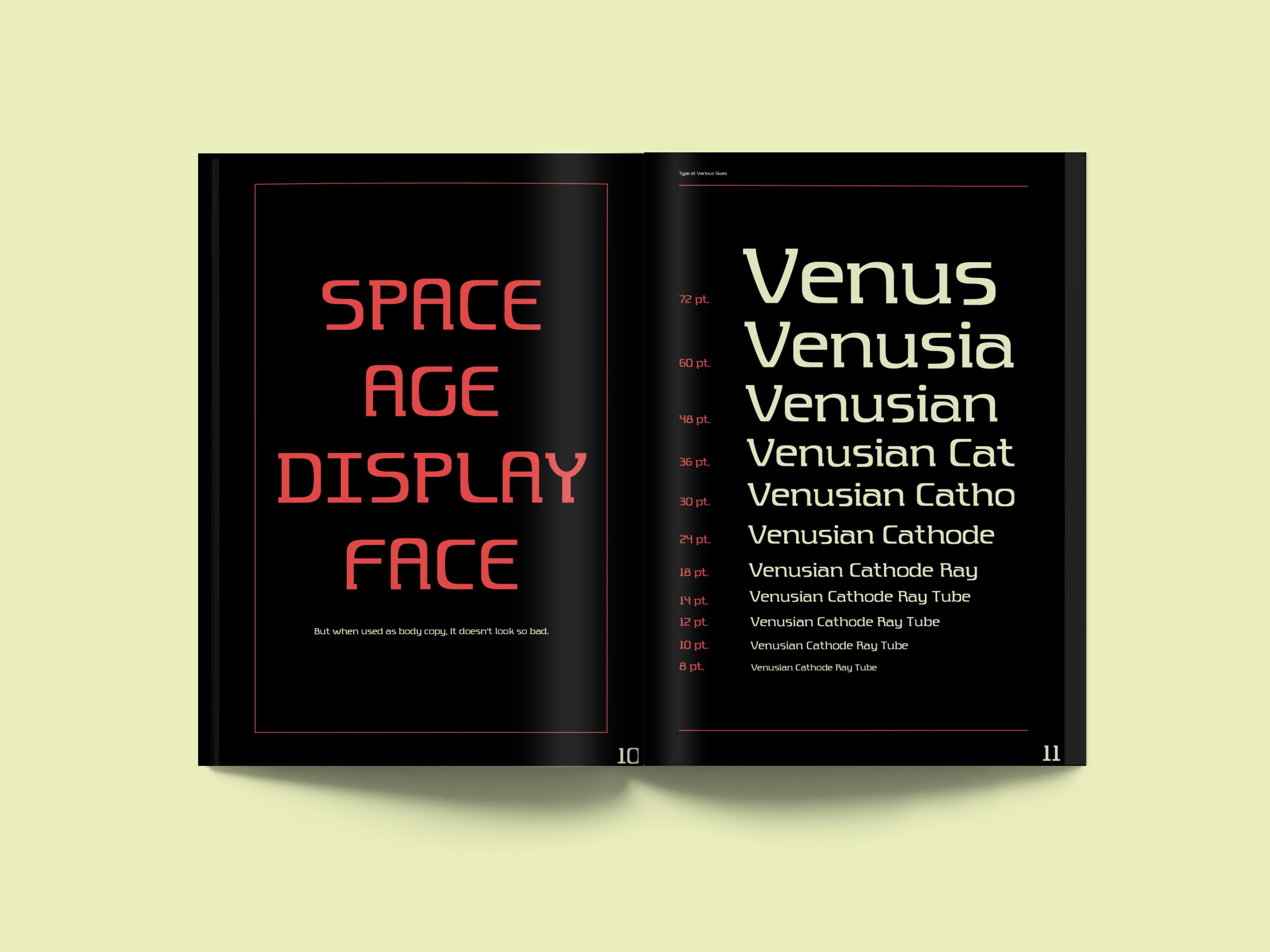
This was my first time designing a typeface and here is the type specimen for the regular weight.
Spring 2020


Bryan Gelderbloom 2020